Monday 28 May 2012

Walk The Moon (Billboard)

Video: Walk the Moon performs "Tightrope"  

Our new video series presents a closer look at -- and an exclusive performance from -- the cool artists hitting the Billboard Tastemakers chart, which brings you the top-selling albums each week based on an influential panel of indie stores and small regional chains. Walk the Moon may be used to loftier heights, but they fit in just fine on the roof of Mophonic Studios,

Jon McLaughlin - Promising Promises

Jon McLaughlin - Summer Is Over (Cover)

Jon’s new album, Promising Promises, is now out today, May 22nd! As Jon McLaughlin fans, this is a huge day for us, and an even more exciting day for Jon himself. So, congratulations, Jon! I know we’re all really excited to be on this awesome journey with you. You can buy Promising Promises at Jon’s official site, iTunes, Amazon, and at Best Buy. So, be sure to pick it up today – let’s show Jon the biggest amount of support we can!

Linkin Park's 'BURN IT DOWN' Video:

On the upcoming LIVING THINGS album, Linkin Park veer away from the political territory they explored on Minutes to Midnight and A Thousand Suns, and instead mine decidedly personal topics — relationships crumbling, trust eroding, faith failing. In a lot of ways, it is perhaps the most aptly titled record in recent history.
As proof, look no further than the first single, "BURN IT DOWN," which is full of lines like "I played the soldier, you played the king/ Struck me down, when I kissed that ring," none of which are about empire building or military service. Instead, the song is very much about the give/take dynamics of a relationship, and what happens when it all falls apart.


Sunday 27 May 2012

Propaganda Posters Part 1 U.S.A.

If you have ever gone to design school, you probably have taken an art history course that covered the topic of ww1 propaganda posters and wwii propaganda posters. The use of propaganda dates back many years, but at the time of these wars the use of posters as propaganda took off to a point where almost every country involved had commissioned graphic designers with the task of creating a vast array of posters.

Propaganda posters were used as a means of justifying involvement in the war to ones countrymen, but also as a means of obtaining new recruits, money and resources to fuel the military campaign.
More Propaganda Posters to Come
Below is a sampling of some of the most popular ww1 propaganda posters and wwii propaganda posters from the United States. We will cover the poster designs of other countries in future posts!
U.S.A. WW1 Propaganda Posters
WW1 propaganda posters were created to convey a variety of messages on topics such as recruitment, bonds and rationing of supplies. The U.S.A. entered World War One in April 1917, but still created many more propaganda posters than any other nation. Below is a sampling of some of the most well known posters.

Propaganda Posters Part 2: Russian War Posters

In our first part of the series we covered propaganda posters of the U.S.A and in part two we will cover Russian war posters from many different periods of Russian history! Russian war posters mainly fall into 5 different periods including the Bolshevik Era (1917-1921), the New Economic Policy (1921-1927), First and Second Five Year Plans (1928-1937), Great Patriotic War (1939-1945), and the Cold War (1946-1984).

Russian War Posters
During these periods of time the Russian propaganda posters were used for a variety of reasons including promoting and building optimism for a new Russian society, eliminating illiteracy and even improving health care. The posters were also used by Lenin and Stalin to promote political agendas; for instance using the posters to attack their political opponents.
Artists of the time struggled over the constant battle between their own opinions and and what the government wanted them to show in their posters. Propaganda is still commonly used today, but the internet and television tends to be a much more valuable medium nowadays.

Groovy Gig Posters

When you’ve got 100+ bands in one city, chances are you’re going to miss a couple of gigs that you would have really enjoyed (had you known about them, at least). There are a billion places a poster might occupy, after all, but around 80% of the time those particular surfaces and what’s on them will get ignored. At this point someone might exclaim, “But there’s the Internet! Why waste money printing things out and waste time finding spots for ACTUAL posters where the vast majority of people might miss them?”

Enter aesthetics. The image in Imaginary Poster 1 looks nice, but what’s with the neon Comic Sans? Imaginary Poster 2 would be okay, except the text looks like it was done in MS Paint with the airbrush tool. See, without aesthetics, the power of the Internet is moot. When you scroll down your Facebook feed, your eyes go immediately to the well-worded anecdotes, the beautiful images from a friend’s recent vacation, and–yes, this is where I was going to put it, how did you guess?–the awesome new gig posters announcing your favorite band’s next show.

What makes a good poster, though? From minimalist vectors to surrealist illustrations, newspaper cut-and-paste to retro ticket-inspired, here are 30 examples of groovy, definitely eye-catching gig posters.
 

How Typefaces Ought to Be in Graphic Design

I had my first brush with typography when I had a subject about freehand lettering in high school. In that class I was exposed to lettering and some of typography’s history. From there, I began admiring different type designs on printed material, from magazines (Ray Gun, Esquire) to posters (“Your Turn, My Turn” and “International Zeitung” posters) and, later on, films and documentaries featuring typography.

Recently, I watched Helvetica (again), the 2007 documentary about the typeface of the same name. I found it very interesting as it is focused on the rise, effectiveness, and eventual ubiquity of the Helvetica typeface. It also provides, as you watch through the documentary, a guide on how typeface must be applied in graphic design and its related fields, i.e., advertising, marketing, and design in general.

Helvetica approached design in a philosophical and psychological way. The designers interviewed for the film were notable personalities in design and typography. They shared different insights on the beauty of type and the functionality of Helvetica in particular. They explained the idea of the proper typeface: an immovable, firm object that floats in space, like air, infinite and unseen yet right in front of us.


Taking Inspiration from Strangers

When I started photography 4 years ago, I had a basic point-and-shoot camera that I brought everywhere. I took photos of trees, interesting cloud formations, even cats that are lounging on small patches of sunshine. I was also fascinated with buildings that have intricately-patterned arches, carved doors, and high ceilings. Taking photos of strangers, though, is more exciting. The thought of capturing a fleeting moment in a photo that can last a long time makes it more special.
Taking photos of ordinary people, for most photographers, is more gratifying because situations are neither staged nor forced. Henri Cartier-Bresson, considered to be the father of photojournalism said that “[…] a photograph could fix eternity in an instant.” His photos, like those of Robert Doisneau’s and Vivian Maier’s, are perfect samples of candid street photography. Theirs are photos that include spontaneous portraits without having any influence on the scene at all.
Street photographers can find subjects everywhere. The streets are filled with moments waiting to be captured. One’s timing, sensitivity, and agility are important to capture moments that would’ve been lost forever. Take your cue from these photos that inspire me (and hopefully, you) to become more observant in my daily strolls.


Unique and Inspiring Caricature Artworks

Caricaturing is the art of illustrating the human face and figure in a way that exaggerates their prominent features. Most caricatures are satirical in nature, making fun of the people being characterized. They are often used in newspaper editorial cartoons and other similar media, although they are made just as often simply for their entertainment value.
The following caricature design examples characterize a variety of personalities, from past icons to present superstars, from famous fictional characters to everyday real ones. If you’ve been looking for caricature inspiration for a while, we hope this post gives you that spark – and maybe even a smirk or two to boot!

House M. D.

new caricature artwork
View Source

Graffiti Writing and Graffiti Street Art

Graffiti writing dates back many centuries, even back to Roman times when art work was scratched in and painted on to walls. In modern time graffiti writing and graffiti street art became much more than just decoration. Graffiti writing became an outlet for political activists to express themselves and also as a way for every day people and artists to express themselves.

It turned decrepit walls into beautiful pieces of artwork and quickly ingrained itself in many subcultures, eventually becoming a world wide art form. Many modern artists have roots in graffiti and the art form has worked its way into many other areas such as graphic design and digital photography.
Graffiti writing and graffiti street art have become one of the most popular subjects for photographers to shoot, as seen below in these 30 great examples.
Graffiti Writing and Graffiti Street Art
graffiti-writing3.jpg graffiti-writing2.jpg

You! Be Inspired!

We’ve had quite a lively and green weekend – we’ve got the Coachella Valley Music and Arts Festival closing out, and on the same day we had Earth Day. Well, if you’re going to count the Friday before the weekend, it’s more a lot more greener than we thought.

Talking about the recent Coachella Festival, we have a feature interview with gig poster maker and ad man extraordinaire, JP Cuison! He’s made unique poster designs featuring some of our beloved cartoon characters. Aside from an interview, we’ll be talking about industrial designer, Dieter Rams’ 10 Principles of Good Design and how you can use it as your graphic design inspiration.

So after a short break we are back to being awesome and we’ve got a few interesting things for this week’s edition of You! Be Inspired!


Festival of Colours


The Holi, the Festival of Colours, is an interesting and colorful event that’s being celebrated by hindus worldwide. In the US, the Festival of Colors was held in Spanish Fork, UT. The colorful event was captured by Thomas Halk. You can check the whole gallery on his flickr, or on his official website.  
Photography 04


Photography 05


Photography 06

History Comics, Fan Art, and Artist Workspaces

Despite having interesting topics to write about, there comes a time when whatever I type looks and feels uninspired. When that happens, I visit the online abodes of my favorite artists. The team stumbles upon new sites and artists often, and that’s what You! Be Inspired! is all about! We hope you enjoy these creative folks as much as we do!

You’ll never look at literary and historical figures the same way when you read Kate Beaton’s well-loved comic, Hark! A Vagrant.  The artist’s simple drawings paired with witty lines are always fun to read. Her hand-drawn comics do not have that overly-edited look, making them easy to read.
 

Spider-Man Artworks

Among the most popular superheroes that have ever been launched, Spider-Man (Peter Parker) may be considered as one of the most successful fictional characters of all time, possibly even second only to Superman. It has been almost fifty years since his first appearance, but Marvel’s number one superhero is still going strong, especially in the minds and hearts of today’s designers.
As a tribute to this true-to-life hero who continues to inspire millions of fiction-lovers, here are 33 Astonishing Spider Man Artworks for all Spider-Man lovers out there. Check out this cool artwork collection as interpreted by talented designers and be inspired. Enjoy!


Impressive Album Covers and Artworks That Rock

Album artwork is a venue where both musician and designer express themselves. It is an important means of presenting music to audiences in a visual sense. With the fast rising influence of the Internet, many people now settle for downloading digital music instead of an actual album; thus, they miss the magic that one can only find in an actual CD and its elaborate casing. With the real thing,  you get to see, feel and appreciate the album more.
Many people buy CDs because of the music, yet for some, they buy for the visuals. It is good to note that album covers should do more than just display something about the artist and the tracks. It should also  help sell the album and at the same time make the enthusiast feel good about the purchase. An album artwork may be in a form of image, illustration, typography or whatever way the artist thinks could convey the message behind his music. As a source of inspiration, we now showcase some very good album covers and artworks. Enjoy these works of art!
album-artwork-ideas-01
View Source

The Art of Rock

Since I’ve talked about album covers in a previous post, I’ve decided you still need a second serving of creativity care of our rock and roll gods. In this second serving, we won’t be talking about the people who created album covers or gig posters (there’s too many good artists out there, today). Instead, we’ll discuss some fascinating trends in designing the proverbial rock poster, as well as processes that most graphic designers use today. Here we go!
Before starting this piece, I’ve had my team scour Google images and Flickr.com for different poster designs. Through the designs we found in those two sites, here’s what we came up:

Trends in Technique

There are multiple techniques in publishing and producing prints of gig posters, and graphic designers have their own way to express their creativity. Some mix and match influences, while some experiment with new media. When it comes to technique preferences here is what designers often choose to do, today:
Hand-drawn/-painted
There are designers who choose to go old school, they draw and paint their designs. Then they’ll have their designs scanned and reproduced digitally. This style gives the poster a rough and sketchy look that serves as its defining trait. Here are some examples:
(Source)
 

Inspirations Straight from the Fairy Tales

Get some fancy poster printing inspiration from some of the most unlikely characters of the grown-up world. You see, we at You the Designer still consider fairy tales fun. (And yes, we still fancy being a child sometimes, too.) With the upcoming release of Red Riding Hood in theaters in mind (and other fairy tale-inspired movies), we’ve decided that a round-up of fairy tale-inspired digital paintings should be in order. After all, fairy tales never grow old.  They still amaze, educate, and entertain. With the advent of computers and tablets, the retelling of the tales only become more exciting.
In terms of presentation, both painting and graphic design has never been the same. These art forms have definitely become more accessible to more people and, although artists have shifted from traditional drawing and painting methods to more technologically sophisticated digital painting techniques, the basics are still there—as long as there is a child, so shall the ageless fairy tales live.
It is also worthy to note that the following graphic artists have taken the liberty to render these characters in ways we have previously not even imagined. Enjoy this collection and feel free to share your thoughts in the comments below.

Little Red Riding Hood

digital-painting-01-fiery-red-riding-hood
Source

If Walls Could Speak: Creative Poster Design

It’s graduation season here in the US, and we’re reminded of the time we spent in our respective universities and colleges. While we’re thankful that we’re done with school, there are some college experiences that we want to relive. Living in a dorm is one of the most liberating things for a student who has lived with parents all his life. The freedom of having things your way is one of the perks of college.

Being the so-called creatives at the office, we all agree that deciding on which posters to plaster our walls with was one of the highlights of living in a dorm. Art to our college selves meant hanging posters of our favorite bands and movies.

(Source)
 

BMW Zagato Coupe

BMW Zagato Coupe, unveiled at the Concorso d'Eleganza Villa d'Este, is the unique collaboration between BMW and Milanese coachbuilder Zagato. BMW Zagato is an exciting and emotionally charged coupe in the finest tradition of automotive workmanship.


BMW Zagato Coupe

History : From Simplicity To Complexity

The story of usability is a perverse journey from simplicity to complexity. That’s right, from simplicity to complexity—not the other way around.
If you expect a “user-friendly” introduction to usability and that the history of usability is full of well-defined concepts and lean methods, you’re in for a surprise. Usability is a messy, ill-defined, and downright confusing concept. The more you think about it—or practice it—the more confusing it becomes. We learned that the history of usability is a “perverse journey from simplicity to complexity”.
(Smashing's side note: Have you already bought your copy of our brand new Smashing Book #3? The book introduces new practical techniques and a whole new mindset for progressive Web design. Written by Elliot Jay Stocks, Paul Boag, Rachel Andrew, Lea Verou, Stephen Hay, Aral Balkan, Andy Clarke and others. Thank you for your time and your support.)

What Is Usability?

Assignment Creativity


I’ll admit that for various reasons I was not immediately interested in Draw It With Your Eyes Closed: The Art of the Art Assignment, until I Dwight Garner’s enthusiastic review in The Times. All in all, turns out Dwight was right: the book is pretty great. I suspect it would be useful to anyone teaching anything creative, and maybe just as useful, in slightly different ways, to anyone who does anything creative for a living or for fun (or both).
I’m using the word “creative,” which is vague and lately somewhat irritating, for a reason. There seems to be some kind of creativity panic going on: Among other things, this video of John Cleese talking about creativity has been linked by all the popular blogs lately, and Jonah Lehrer’s Imagine: How Creativity Works, has become a best-seller. An advertisement for the latter appeared a few weeks back in The New Yorker, and featured this image:

Long Live Graphic Design

ExhibitionClockwise from top left: Karen, Karen, issue 3, 2007; Laurenz Brunner, Akkurat typeface, 2005. Courtesy Lineto; Fanette Mellier, Specimen, 2008; Mike Perry, Eames Eiffel Side Chair, 2010; Felix Burrichter and Dylan Fracareta, Pin-Up, Issue 10, Spring/Summer 2011; cyan, Flieger, 2010. Courtesy Maharam Digital Projects


Editor’s note: The following essay was completed prior to Rick Poynor’s review, “Read All That? You Must be Kidding Me?” of January 2012 when Graphic Design: Now in Production was completing its run at the Walker Art Center in Minneapolis. The second venue for the exhibition, hosted by the Cooper-Hewitt National Design Museum, opens tomorrow on Governor's Island in New York City.

“Graphic design is dead. Long live graphic design”
— A note on emerging cultural relevancy for graphic design

Little Libraries in the Urban Margins


A few years ago libraries were flying high. I wrote a book about the so-called "third wave" library-building boom of the '90s and early aughts, a boom made possible in part by the dot.com bubble. Today, nearly a decade later, our cities and their libraries find themselves in a very different situation. While libraries are welcoming record numbers of visitors and breaking circulation records, library budgets are facing drastic cuts, some of those flashy new buildings are often shuttered, and cities are resorting to the privatization or outsourcing of library services. Meanwhile, many services that patrons once relied on libraries to provide — specifically the provision and preservation of information in multiple formats — are now accessible elsewhere, including in our living rooms, and even in the palms of our hands.

Libraries are about much more, of course; they exist not simply to store and provide access to information. Advocates argue that libraries continue to serve crucial civic and social functions, and their tenacious faith is reinforced by a flurry of recent street-level library activity. The last few years have seen the emergence of myriad mini, pop-up, guerilla and ad-hoc libraries, which are part of the phenomenon that Mimi Zeiger, in her Interventionist’s Toolkit series for this journal, calls “provisional, opportunistic, ubiquitous, and odd tactics in guerilla and DIY practice and urbanism” — to which I might add, librarianship. Nowadays we have libraries in phone booths and mailboxes, in public parks and train stations, in vacant storefronts and parking lots. Often these are spaces of experimentation, where new models of library service and public engagement can be test-piloted, or where core values can be reassessed and reinvigorated. They are also often an effort to reclaim — for the commons, for the sake of enlightenment (or does this term now carry too much baggage to be used without scare quotes?) — a small corner of public space in cities that have lately become hyper-commercialized, cities that might no longer reflect the civic aspirations of a diverse public. As DePauw University librarian Mandy Henk puts it, “They ... show the power of self-organization and what people can build working together, outside of traditional institutions. Building and using them is a form community empowerment.” [1]

Thursday 3 May 2012

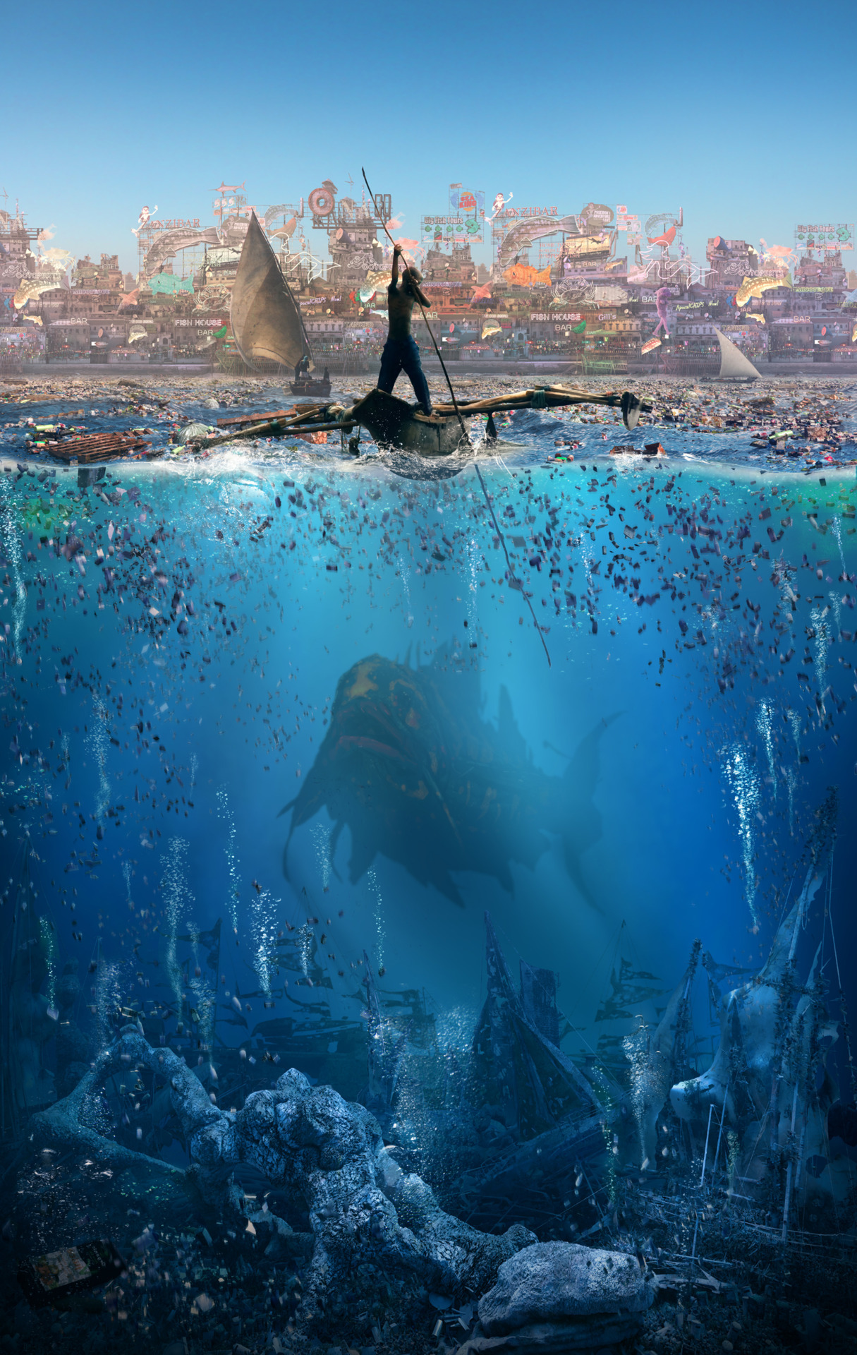
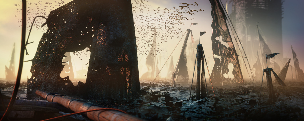
Sea of Dead


Boat Graveyard_
Concept Image showing a series of dead boats that have been abandoned and have slowly drifted further out to sea. Recent drafts of the script leave the fish swimming out into the sunset withe  sea of dead boats behind him. This scene could potentially work as a final shot.

An outbreak of violence echoing


 Brixton has degenerated into a disregarded area inhabited by London's new robot workforce - robots built and designed to carry out all of the tasks which humans are no longer inclined to do. The mechanical population of Brixton has rocketed, resulting in unplanned, cheap and quick additions to the skyline. The film follows the trials and tribulations of young robots surviving at the sharp end of inner city life, living the predictable existence of a populous hemmed in by poverty, disillusionment and mass unemployment. When the Police invade the one space which the robots can call their own, the fierce and strained relationship between the two sides explodes into an outbreak of violence echoing that of 1981.

Wednesday 2 May 2012

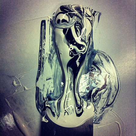
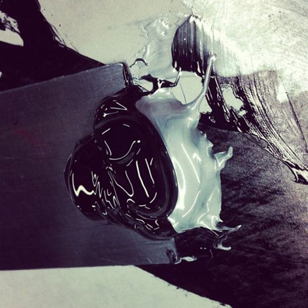
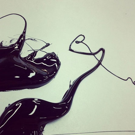
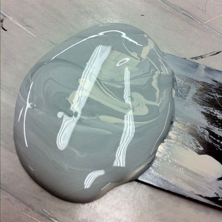
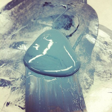
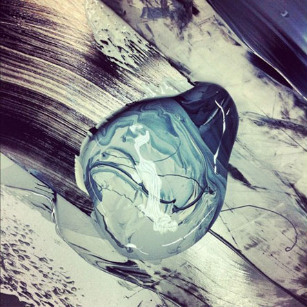
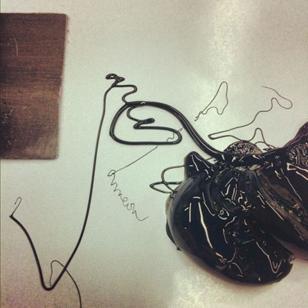
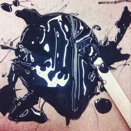
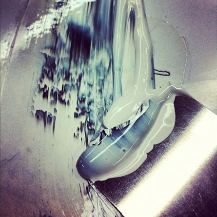
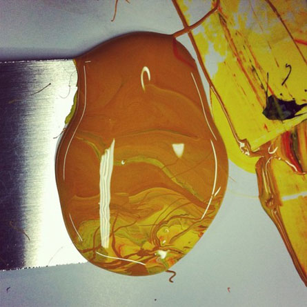
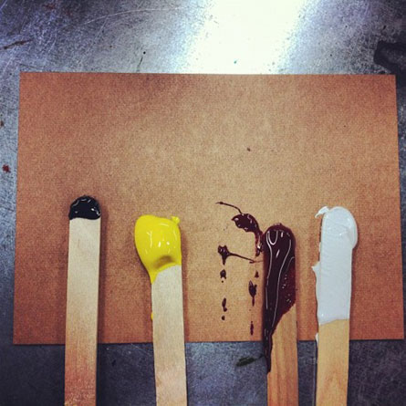
Mixing an orange ink with yellow and rubine red inks


http://distilleryimage5.s3.amazonaws.com/a16a074e90a311e1abd61231381b6d77_7.jpg
Is using Instagram - a fun & quirky way to share your life with friends through a series of pictures. Snap a photo, then choose a filter to transform the look and feel of the shot into a memory to keep around forever.

by dolcepress

Letterpress inks

Dolcepress get used to shoot the ink and other things to show a nice "behind the scene" of letterpress printing...

by Dolcepress

Just like Extremely Loud & Incredibly(Animation)


 Just like Extremely Loud & Incredibly Close. A , Francophile, and pacifist searches New York City for the lock that matches a mysterious key left behind by his father, who died in the World Trade Center on September 11, 2001.

Things Change - Jo Peel Art


 A 3 week painting condensed into a 3 minute animation. This is a short story told on a big wall at Village Underground in Shoreditch, London Jo Peel is a member of internationally acclaimed Scrawl Collective. Jo spends her time documenting in great detail her fascination with everyday scenes and scenarios. From abandoned east London construction sites to the streets of any place she might find herself, all are captured in her well observed and uniquely executed style. Things Change is an optimistic look at the idea of human impermanence. The buildings and debris created by the human exploitation of our natural environment decay and give way to the force of nature once again. more art

A day in Venice (Venezia)

A day in Venice (Venezia) in Italy, from daybreak to sunset in timelapse. It's really a great place and I hope I can share some of its magic with this short video. Some technical specs: Shot mainly with my trusty Canon G10 (and not a G12, like I wrote here first). Post in Motion, After Effects and Final Cut Pro X. Music: Heart of Champions, Chris Haigh, premiumbeat.com